The story of Xanhhub originates from green coffee beans (Xanh means green in English), an important stage of the From Farm To Cup journey that impacts the enjoyment quality, and economic value of coffee. Xanhhub was built as a prestigious center for assessing the quality of green coffee beans, and also as a training center for knowledge and skills in quality assessment for people doing business with coffee. All for the mission: good coffee should be enjoyed everywhere, the economic value of green coffee beans in Vietnam will be increasing day by day.
From the brand narrative, the identity of Xanhhub must highlight: the role of coffee beans with the existence of Xanhhub and the role of a training center, which provides knowledge and training skills in quality assessment from seasoned professionals.
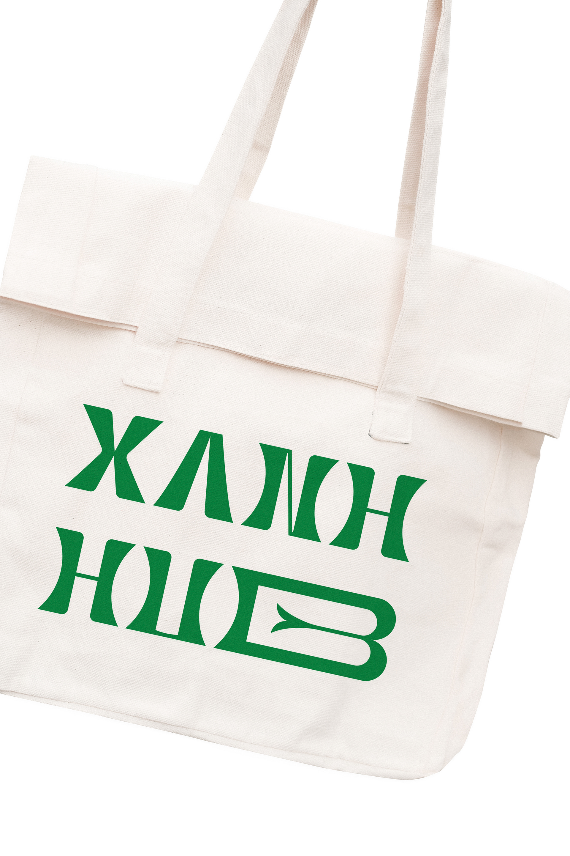
Xanhhub’s wordmark logo was built from a unique creative font based on using the coffee bean shape to create a curvature for the stroke. It could be said that the coffee bean crafted the typography or the central role of the coffee bean in the birth and mission of Xanhhub inspired us to implement this idea. “Hub” was specially treated to feel broad enough in terms of knowledge, seasoned enough in experience to be a trusted place to assess the quality of green coffee beans.
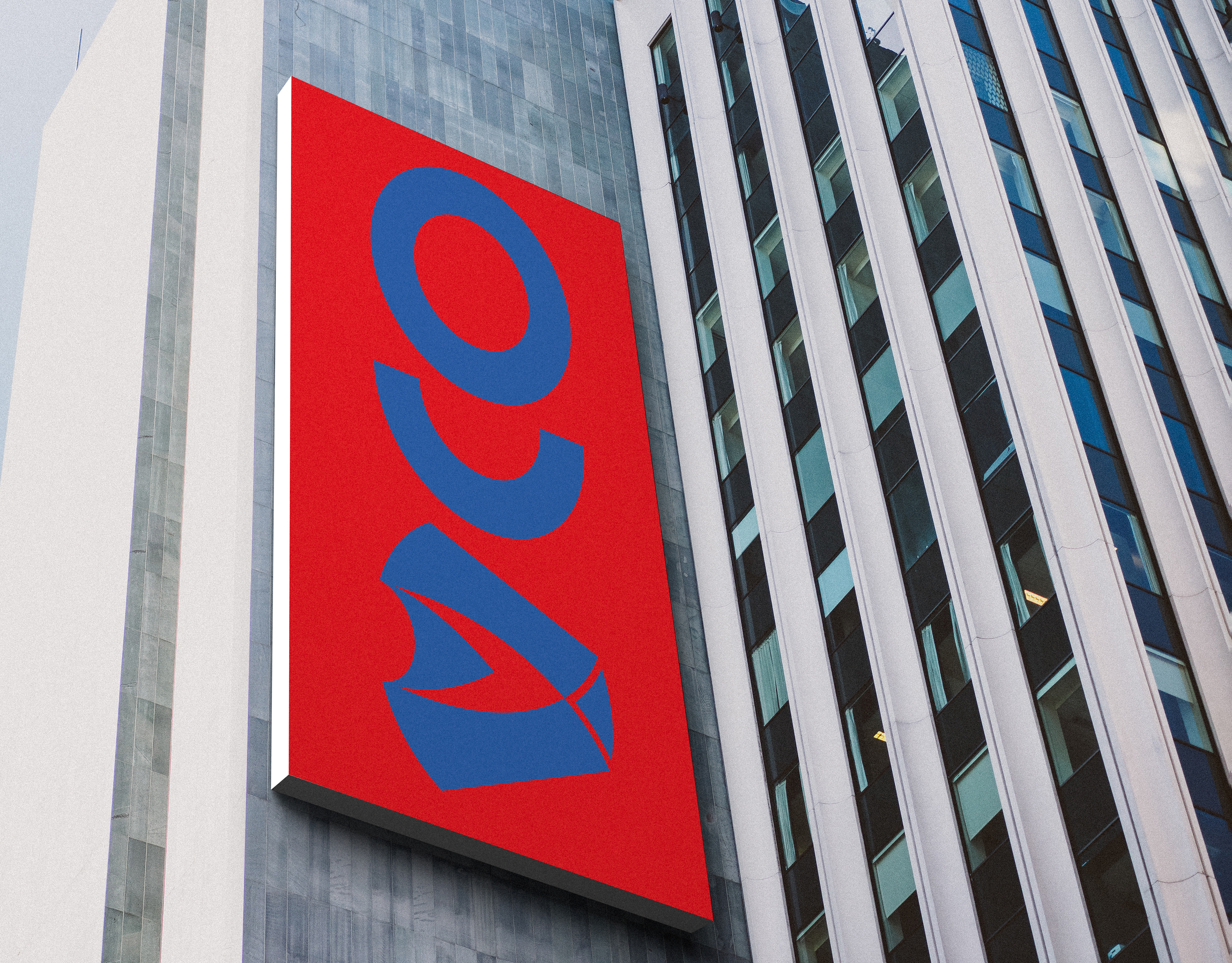
The symbol was developed from the first letter of the brand name and the coffee flower to create a seamless connection with the Xanhhub’s expertise.
The color palette ranged from the green of green coffee beans to the brown of roasted beans through different levels from light to dark roast. The palette was inspired by the coffee bean's missionary journey from the green bean to the flavorful end. It is also a journey associated with the operation of Xanhhub.
Patterns were also created to convey the consistent spirit of Xanhhub in printed items or decorations.

